


In any Machine Learning task, a model is said to be good based on its performance over one or more evaluation metrics. Hence, before jumping into training models, it is often better to understand which evaluation metric is better suited for the task at hand and then proceed with choosing the best model that optimizes the metric.
In most cases, a simple analysis of the model’s performance can give interesting insights which can be used to improve the model.
In this blog, we will explore the Receiver Operating Characteristic (ROC) curve and how they can be used to measure the model performance.
 Radar (source)
First, a bit of history [1], the ROC curve was first developed by electrical engineers and radar engineers during World War II for detecting enemy objects in battlefields and was soon introduced to psychology to account for perceptual detection of stimuli. Nowadays, ROC curves are increasingly being used in Machine Learning and Data Mining Research.
Introduction:
In a binary classification task, there are four outcomes from the predictions made.
- True Positive (TP): The prediction and the ground truth, both are True. Correctly predicted.
- True Negative (TN): The prediction and the ground truth, both are False. Correctly predicted.
- False Positive (FP): The prediction is True while the ground truth is False. Also called False Alarm *or *Type I error.
- False Negative (FN): The prediction is False *while is the ground truth is *True. *Also called *Miss *or *Type II error.
Now that we know what the possible four outcomes are, let us now understand what a confusion matrix is,
A **confusion matrix **[2], is a specific table layout that allows visualization of the performance of an algorithm, typically a supervised learning one. Each row of the matrix represents the instances in a predicted class while each column represents the instances in an actual class (or vice versa).
Confusion Matrix (source)
The above diagram is for a binary classification task. The confusion matrix can be extended for multiple classes as well (it will be n x n matrix, where n is the number of classes).
Some definitions:
Let me now define some measures that are useful for understanding the ROC curve.
- True Positive Rate (TPR): Also called *sensitivity (or recall), *it is the ratio of the True Positives to the Total Real Positives.
 True Positive Rate
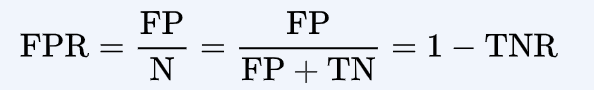
- True Negative Rate (TNR): Also called *specificity, *it is the ratio of the True Negatives to the Total Real Negatives.

- False Positive Rate (FPR):
Now to the final part, the ROC curve
An ROC space is defined by FPR and TPR as x and y-axes. It is sometimes also called the *sensitivity vs. (1-specificity) *plot.
Each instance of predictions represents a point (corresponding to a threshold) in ROC space.
What is the threshold? The threshold is the probability value, above which the model is said to predict a positive and vice versa. This is a hyper-parameter that decides whether to classify a data point as positive or negative.
Different points, corresponding to different confusion matrices. (Source)
The best model is the point corresponding to the left top corner. And the line *y=x *corresponds to a random guess.
Hence, we choose a threshold in such a way that its corresponding point in the ROC space is above the line *y=x *and to the left as far as possible, i.e. TPR is close to 1 and FPR is close to 0.
Area Under the Curve (AUC):
AUC is an important metric in deciding the model performance.
The area under the curve
For different values of threshold, different points are plotted in the ROC space, the locus of which forms the ROC curve.
The AUC measures the degree of separability between the classes. It gives us a measure as to how well the model is able to predict positives as positives and negatives as negatives.
Thank you.
Milind Kudapa
Senior Undergraduate at Indian Institute of Technology, Delhi.